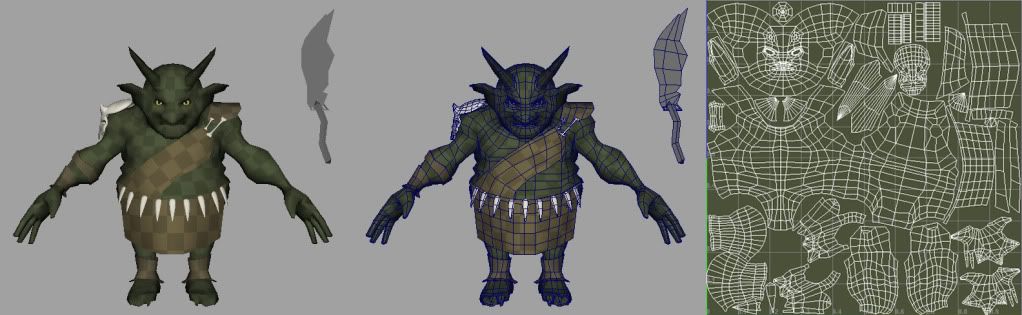
A lot of the empty space on the goblin's UVs, im saving for his weapon, which I have been considering redoing. both of these have default lighting, forgot to take it off for screen grab.
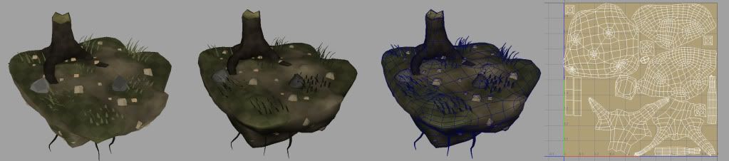
In the bottom left of the scene UVs, im saving that space for vines and leaves. First shot is no lights, 2nd is default lights.
I am seriously doing something wrong with these pictures...
ReplyDeleteFor one....The tree grass and stump need to pop so work on some contrasts and this is your world so putting in a flower won't kill ya. ALSO your UV's need to be mapped in such a way that the teeth ARE NOT big. Small items need less space but keep items such as upper body and head (seem primarily large - player focus) need to have more space
ReplyDeleteI'll play around with the contrast of the scene and send a few different versions. As far as the teeth (assuming you mean the little ones on his loin cloth) go, their UV space is extremely small. The two tooth like shapes in the bottom left, beneath and beside the legs. The bigger spikes you're probably seeing are his head horns, i figured they'd need proportionally as much space as the face itself.
ReplyDeleteI tried to prioritize the head and body as much as possible without making the clothes too pixelated, it's going to be a 512. Should I make the clothes smaller and scale something else up instead?